The Evaluation
IN WHAT WAYS DOES YOUR MEDIA PRODUCT USE, DEVELOP OR CHALLENGE FORMS AND CONVENTIONS OF REAL MEDIA PRODUCTS?
My music magazine both used developed and challenged the normal codes and conventions of already existing music magazines I think.
How it used them:
I designed my title font for my magazine so that it conformed to the normal codes and conventions, as most music magazine have a bold title which is clearly visible and also the title is slightly behind the main image.

This indicates that the magazine title is easily recognised as it is popular and people know of it and is a typical convention which is why I used it. My magazine used a main image which is used in all music magazines. The image is of the person that the main article is about so makes him centre of attention. My front cover also has a main headline and a quote underneath to clearly show what’s inside and linking to the main image which I saw on plenty of magazines. My double page uses a word that is often used and that is ‘exclusive’. This is because it is a word that catches the readers’ eye and makes the article more appealing. I also used ‘exclusive’ on my contents page to make the reader get drawn to that page and to read on throughout the magazine and obviously buy the magazine. The front cover for my magazine, I used a puff line above the mast head to show off the fact that my magazine was the best selling magazine in Britain
How it developed them:
On the music magazines I have previously researched, I began to notice that most magazines only keep their brand identity and colours on the front colour, because my challenge was to develop my own music magazine, I felt that it was key to keep to this concept. I did however; make sure the masthead was used on every article and the colour schemes of the contents page and double page spread were the same colour scheme than my front cover, black and yellow. Another feature I developed is that I used quotes from the double paged spread on my magazine title page. This makes the reader curious about what is happening inside the magazine.
How it challenged them:
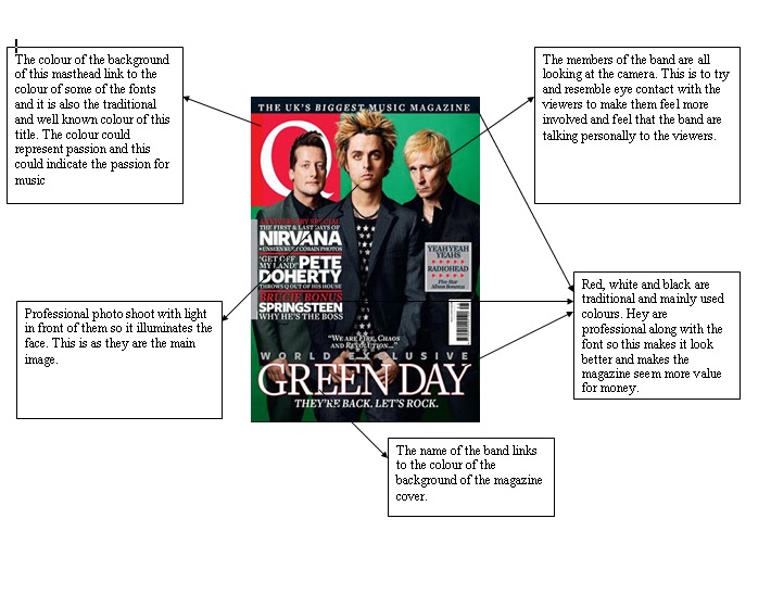
On the front page instead of following the typical codes and conventions for camera angles, I decided to do the photos with the model looking to the right and making no direct mode of address with the reader. I did this because I thought that being a young and up and coming artist, a direct mode wasn’t necessary as due to it being his first interview, nobody knows his personality and I want the article to be more appealing so people get to know him better. I have also made the main image the only image on the front cover so that people only pay attention to that image and feel that that person is very important and the interview is worth reading. I have also left the main image in its natural background; this is so that people feel that the artist is more laid back and a genuine person.
HOW DOES YOUR MEDIA PRODUCT REPRESENT A SPECIFIC SOCIAL GROUP?
My media music magazine targets and represents specific social groups in several ways. Below is a print screen of my summary of this created in Word Document stating how gender, price, the main image, name, genre and the colour schemes represent a social group of my choice.
My media music magazine targets and represents specific social groups in several ways. Below is a print screen of my summary of this created in Word Document stating how gender, price, the main image, name, genre and the colour schemes represent a social group of my choice.

I also made a questionnaire and made a mixed group of people questions about a music magazine. From the results I got back, I was then able to carry on with the development and design process of my magazine. My magazine is completely representative of a specific teenage “stereotype” of the R&B genre. The name of my magazine, ‘Boxbeats’ was chosen due to the high amount of votes it got from a wide range of people. This means it appeals to many people and will make the magazine more appealing compared to others. The main age range that mainly appealed to R&B music was 16-21, this meant that I had to ensure that everything in this magazine was suitable and more importantly appeal to this age group. The price for the magazine is an important factor. Due to the age range chosen, I couldn’t make the magazine too expensive as the money that they have is much lower than older people. The most popular price that people were willing to pay was £2- £4 however this was to all people so people above the age range chose this figure as well. As a result, I have chosen the lowest number from this category, being £2. This is so the target audience can afford the magazine and it is also of a similar but slightly less price than other magazines in the same genre, making my magazine more appealing. I also took results for what people would be interested in with the content of the magazine so I ensured that I used those in my contents page so more people were interested in the content.
WHAT KIND OF MEDIA INSTITUTION WOULD PROMOTE YOUR PRODUCT AND WHY?
For my magazine, I think the music industry would be most interested and most effective in promoting the product as major labels like EMI Group and SONY have huge publishing businesses all over the world and distribution ones too. If my magazine appealed to them enough and a particular genre of music they focused on, they might be interested in promoting my product to my audience in return for a share of the profits that are made from the sales. Labels like these then give the opportunity for the magazine to then be sold in major music stores such as HMV, which is an ideal place as it is a store where many people in the genre and age range go to purchase their music, so selling a music magazine there would result in more sales. Another way of promoting my magazine would be to get involved with iTunes so that they advertise my magazine on their website. This would help as a lot of people purchase music from this site so many people would see the advert. A media institution that would also be successful in advertising is Facebook. This would help majorly to promote my magazine as most people aged between 16 and 21 tend to use Facebook, meaning the advertising would be seen daily by many people. With advertising like this, if successful, supermarkets and shops may get in touch to sell the magazine in their stores. This would mean that the magazine is available everywhere and would increase the popularity and the number of sales, resulting in more profits.
WHO WOULD BE THE TARGET AUDIENCE FOR MY MEDIA PRODUCT?
As I have stated before, the target audience that was most common with reading R&B magazines was 16-21 year olds. The gender was quite evenly spread so I made sure that the colour scheme was a colour that is suitable for both genders, enabling both genders to feel comfortable when buying the magazine. I have used artists which that age range would appeal to and also the content of the magazine also being ideal. From my questionnaire, I have found out what everyone is interested in seeing in an R&B music magazine, so I have involved these in my contents page so that people are more interested in the content of what is inside. Due to this age range as well, the income of the target audience won’t be high so I have made sure that the price is at a level in which people can easily afford.
HOW DID YOU ATTRACT/ADDRESS YOUR AUDIENCE? I attracted my target audience with the front cover by using a lot of graphic features that are bold and would then grab their attention. It also helped that I used black a lot on the front page as this contributed towards the bold, graphic and confident atmosphere given out. The picture on my front cover links to the audience as it gives off a laid back and cool image which most of the audience would be. I made the colour scheme of the front cover of the magazine black and yellow. This is because they will appeal to both sexes and also recently a song by an R&B artist has come out called Black and Yellow so it links to the genre. It will also stand out from most other magazines as yellow is a bright and bold colour. The image was also a lot larger and at the centre of the page, making it the most important feature and being much bigger than all the writing. This makes it more appealing as people don’t look at the writing, just the image and that is the most important part of the front cover.
On my double paged spread, I tried to keep a graphic feel and the two images on the right hand side will catch the reader’s attention, they will then see the quote and want to read the article on the left side. I have used the word ‘exclusive’ underneath the main heading to catch the readers attention and make them feel that they need to read on and find out more due to the article being exclusive. I have stuck to the same colour scheme as the front cover and contents to keep the image going throughout the magazine and once again, is comfortable to both males and females. I put the title of the magazine at the bottom of each page so that people can always identify what magazine they are reading.
My contents page I used the same colour again to keep the identity of the magazine. I also used the word exclusive yet again, to make that story stand out. I used other images of different people to make sure that other sections of the magazine get a mention and people don’t only read the main article.
I used bold, clear fonts throughout all of the 3 parts of my magazine, this is so that they are clearly visible and easy for the viewer to read so the viewer gets drawn to them easily and can easily read them even with a quick glance.
WHAT HAVE YOU LEARNT ABOUT TECHNOLOGIES FROM THE PROCESS OF CONSTRUCTING THIS PRODUCT?
Whilst creating this product I feel that I have learnt huge amounts of information about computer programs such as Adobe Photoshop which I didn’t know how to use before doing this subject. I began to use Microsoft Word to initially do my front cover as I was used to using it, however I then realised that publisher was better to move objects around and edit things easier so I decided to move my work onto publisher. Adobe Photoshop made my images look far more professional and enabled me to get rid of the background, like my contents page. It was hard to use at the start but I got a teacher to help me edit a photo and how to do everything which helped me a lot.
Photoshop also helped massively where I was trying to get the right font for my title and text for the front page because I had been looking on websites to download some fonts but had found none that I like. On Photoshop I also learnt how to edit just plain fonts to make them look a lot better. You can see more about this and how I edited the title in my folder.
I also learnt about pixilating images and making them fit perfectly on the page so that it didn't stretch the pixels.
I also learnt about pixilating images and making them fit perfectly on the page so that it didn't stretch the pixels.
HOW DO YOU FEEL YOU HAVE IMPROVED FROM YOUR PRE LIM TASK?
Overall, looking back at my pre lim task and my final construction pieces for that (see folder) I feel that I have improved most on my knowledge of computer programs and how to use them effectively for this coursework. On the pre lim task I used the program Microsoft Word Document and simply paint because I felt most familiar with them. However when I realised that Publisher and Adobe Photoshop were much more effective and better to use, my magazines looked more professional.
I feel that I have also learnt far more about the codes and conventions of a magazine and I know the features that help appeal to certain audiences. I did this by reading more magazines and looking at them in shops, noticing what features catch my eye the most so I could use them on my magazine.
Another thing that I have improved on is my photo taking. My pre lim photos weren’t professional looking and weren’t ideal for a professional magazine, however I feel that with a more planned and longer photo shoot, my pictures were much better. This was mainly down to the location and linking it to the articles inside and putting out a certain image that would appeal to the target audience that my magazine appeals to.